The Coffee Parlor
ROUND 1
The owner of the Coffee Parlor enlisted my help to create a complete branding package for the shop. We started with only the name. I met with him to talk through his vision and the story he wanted his branding to tell. After our first meeting I delivered this first round of concepts.
The two concepts I was most excited were this first one, which is the bottom half of a full coffee cherry, with the bean sticking out of the top half. I wanted it to read like a big smiley face.
The other one is the use of “COPA”. I thought it would be cool to abbreviate Coffee Parlor as CO-PA, not only because it’s short and catchy, but it’s also “cup” in Spanish. I thought it worked Well and I gave a couple of looks at it.


ROUND 2
The feedback from the first round was that they were digging the cup and COPA, but not the smiley coffee cherry. Oh well. I like COPA and knew that it could really bring the whole brand together. Additionally, they liked some of the traditional vibes but with a more refined look. I put some more versions taking onboard the totality of their feedback. I threw in a curveball at the end just to test their convictions. Branding is a big deal and I want them to feel like they’ve seen enough good options.

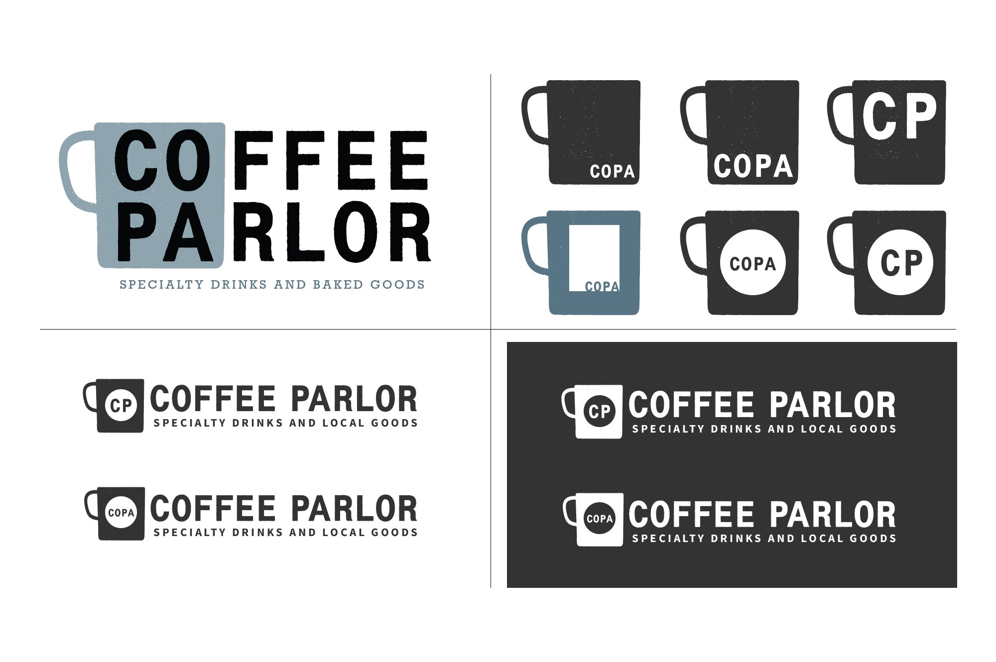


ROUND 3
After round 2 we felt like we had a solid direction. The simple bean “o” in the word mark, the cup symbol, and using “COPA” as a sub-mark. I did one last round of comps to look at some options and bring it into focus.


FINAL
After much deliberation and many revisions, here’s where we landed. The branding has now been used in all of the real-world use cases the business needs and it’s been successful.


